Monday 31 March 2014

Final Editing

During today's editing session, I put all of the clips in the final order and decided if anything needed extra cutting or if we had cut too much off originally, if so placing the original clip back into the sequence and re-cutting it. One clip we had, where Luke's character (the motocycle character) was taking his jacket off and we had to but it slightly and delete the middle bit to make the pace a bit faster and he was taking too long to remove the jacket, it turned out to look 'jumpy' so i removed the last part. I kept it simple by keeping the first part of the clip and the continuity of the sequence was not interrupted. Furthermore, the sequence was back running smoothly.


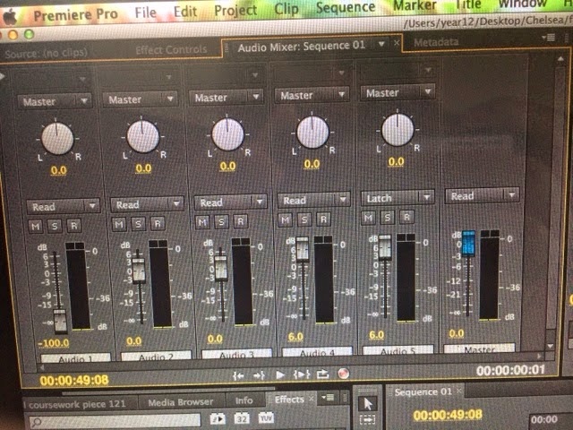
I then moved on and focused on the volume of some of the sounds that we were looking at. I mainly focused on volume controls, I needed to work out independently how to turn down the volume of the ambient sound in some places and turn up the volume on the non diegetic sound in some places. Within the premer program, there was a volume controls mixer, which helped me change the volumes of all types of sound at different parts of the sequence. This was good as it meant most of our clip could be non diegetic sound as we wanted but also we could make the ambient sounds obvious to show that we have understood the importance of different types of sounds and what effects they have on the title sequence and the full opening sequence. We wanted test how the volume of sound effected the tension and furthermore the meaning it was representing to the audience.

Saturday 29 March 2014

Post production

After filming, you upload the footage you have and begin to edit, by edit, I mean cutting, re-arranging, adding sound, etc. I have learnt all of this through the media course, my skills have improved massively considering I had never used the premiere program before. I had no idea how fitting footage together worked and I had no idea how to cut either.

When you get to post production, you often come across mistakes that you have made when filming and often realise that there is some footage that cannot be used. The most common example of this is accidentally utting a characters head off when filming. For example the top of the shot is there forehead so the whole character is not in view. This is excepted if it were to be an extreme close up where you only see their emotions of their face but if you are filming a mid or long shot and you are showing the character but cutting the top of their head off because of bad camera work, then this is obviously seen as a problem.


Here is one of the problems that I found when looking through all of the footage that other members of my team had filmed. Mistakes like this are common but are so important that it makes shots like this shot end up wasted as they cannot be used. Half of the character is cut off (the side of him) it is important when filming that people are aware that if you are going to film a character then you need to make them the priority, another priority in this shot if the motorcycle, the bottom of the motocycle is cut off and it is not in the middle of the shot, this is so important. This means that the meaning created to the audience is not correct, a shot like this would not create tension for the audience. The mise-en scene is ruined in this shot as there is no clear definition as to why the character is wearing hat costume, what does the costume contribute to his character, why the motorbike is there and what meaning that creates. These mistakes are easily made but easily avoided also. As a group we went through all of the mistakes within the major shots that has problems. We realised what we were doing wrong and what we could do to help each other with future filming.

One of the problems we faced especially were with out pan shots for our sequence. We felt as if a pan shot would build tension for our audience. Although it was not too long, it was still longer than other shots, showing a pan would present to the audience that the specific character in view is important. We tried so hard to get the pan shots completely perfect however it was extremely difficult. Most of the pan shots began very well but as it was difficult to keep the continuity of the same shot, it was often the case that it went well but towards the end, whoever was filming, moved the camera slightly faster than they had been before ths point in the shot.

Friday 28 March 2014

Order of Titles

There is a specific order of what names and what jobs are seen first by the audience on the screen, whether the titles be on a coloured solid background or whether they are placed on the action. We have learnt this order as a 'rule' in order to ensure that we follow this.
The orders as follows; 

  • Name of the studio
  • Name of the production company
  • Starring
  • Filmed by (cinematography)
  • Sound (if necessary)
  • Editor
  • Producer
  • Director
We have followed this order so that we stick to the rule so that it is clear who the most important people within the film actually are. In our case, all titles up until the end of the actors/actresses names (starring), are on a black background in white writing. They appear using a film dissolve and when they come on and off I have made sure in editing that they appear to the sound of the audio. Obviously at this point, working with the sound, a few changes can be made, in order to create as much tension for the audience as we can.

From our research, and focusing on the psychological thriller genre, these opening credits are shown in the beginning of the opening sequence (usually within the first quarter but in only some cases the first half), as the codes and conventions of this genre show this is a normality. We have set these opening credits fairly and have explained through them the workload that has been completed by the team.

Our titles appear as below:

Name of studio
motion cube pictures presents

Name of production company
a PCLA film

Starring
Aman Dhillon
Luke Mayes
Lisa Machin

Filmed by (cinematographer)
Priyanka Chawla

Sound
Luke Mayes

Editor
Chelsea Wilson

Producer
Priyanka Chawla

Director
Chelsea Wilson

Thursday 27 March 2014

Final Titles

Independently, I have created the final titles for the sequence, I have used different sections of adobe premier and looked online at youtube.com tutorials to help me. I started by using the transitions and adobe premier provided me with, but by delving deeper into the program I could see that there were more technical ways to create the 'fades' and the 'slides' I wanted for the titles. It has taken me a reasonable amount of time to create these titles as I worked extremely hard to get them perfect for our opening. I had to use more features in adobe premier and I made use of photoshop. I placed the titles I wanted to create onto a grid and  had to ensure that the positioning was right, for example the 'a pcla film' had to slide on, so I needed to ensure that I create the right feeling for the audience. I feel that by using my initiative and looking at tutorials online, I have broadened by skills set which will help me within the future and help me when I progress with the media course. I used a different font for the two companies we have used

motion cube pictures presents 


a pcla film


However I then changed the font for the other titles (director, producer, etc).
We finally decided on the harting font, as it fit in the genre for a psychological thriller theme that we wanted to match our opening sequence. The font we used looked like it had been scratched. It was used to give the audience an eery feel. It was used to build tension. I hoped that my group would agree with the way I created the titles and the way I had presented them to create meaning for the audience. These titles were also placed in different parts of the screen, and the way that the sound matches them, creates dramatic tension for the audience. However later on in the sequence, we see the crew titles appear on the action. Although, the director is seen as the most important figure in making the opening sequence, their title has been enlarged and centred in the screen to show importance. 


Overall, I think that I have created meaning for the audience. I spent a lot of time focusing on the titles and watching other psychological thriller opening sequences such as films created by Alfred Hitchcock within this genre. I believe that I have used films such as  'Se7en' and 'Psycho' to influence me in terms of font and technically the way that the titles enter and exit the screen. I looked in detail at how long a title should stay on the screen for in order for the audience to be able to read it but to avoid the audience becoming bored, as this would completely defeat the object of keeping the audience engaged and keeping a constant state of meaning for the audience to relate to. 


Wednesday 26 March 2014

Black and White?

Colour films were introduced in the 1930's/1940's, however they were very expensive to produce , leading most production companies unable to afford to create these colour films; this is why a lot of films continued to be created in black and white until a lot later. Black and white gives a sense of originality to the audience, it is fact that they also make the audience feel slightly at ease. Black and white films are also knows for creating tension for the audience.    

A famous modern film, created in 2012 called Tabu, was created in black and white.

This film was directed by the famous Miguel, the film is set in 1930's for part of the film and the 1960's for the other. It is typically expected that it would be created in black and white. The film begins loud, with full sound, but soon degrades from this into silence. This leads us to believe that creating a film in black and white allows us to completely change our storyline and change the mood that is represented to the audience.


We have been looking into changing our opening sequence and making it black and white. However it has got to the stage where even with our research, we were still unsure about changing the colour balance of our opening to make it black and white. We do not want our opening sequence to appear as if it is a film noir. We want to make it clear that our opening sequence is partially a psychological thriller and an action thriller. Although from our research we have learned that as a part of the psychological thriller, it is common to see these thriller changed to black and white, however or research on action thrillers shows differently.

Progression

Over the last few weeks I have seen a lot of improvements within my group and also within myself, I know that my skills base has expanded and I have made a lot of personal progress in terms of my confidence for filming and editing of our opening. In the last week I have learnt how to make a title composition for the name of our film, I was pleased with it for a first attempt but after analysing it and looking at how it would appear in our sequence, I realised that there were a lot of changes I needed to make.


I have looked at this composition closely and in my opinion, the letters of the word 'chance' come in too quickly and it doesn't seem right and to me doesn't fit in correctly. I also do not like how we can see the letters at the bottom of the screen before they flip and come onto the screen, it doesn't flow correctly. My final problem with this composition is that the text is in a white font and the flashes behind the text are also white so we lose some of the letters behind the effect. I am going to re-make this and make the letters move not as fast and do my best to have the letters beginning off of the screen. I also think it may look better with a different effect behind the text; possibly just a plain black background behind the text.

Looking back at my skills base from the continuity task, I could not even film the most simplistic of shots and had to learn to edit from scratch, a few weeks ago the only editing technique I knew was how to cut using the razor tool on adobe premier pro. I can now edit using all sorts of tools, adding in transitions and effects such as dissolves, fades and wipes. My teachers were also pleased with the way I had applied my knowledge of parallel editing to show two different characters journey at the same time but still making it clear that it is not the same character especially using shots that do not show their faces.


In terms of my project; I was extremely behind regarding the work I had been assigned to help the group and pull the group forward with the project. However I soon fixed these issues, became more organised and realised how important it was to me and how much I wanted to do well. I now consider myself one of the leaders of the group, I feel that if I do not take the responsibility of delegating tasks within the group otherwise tasks do not seem to get done. I feel I have taken a lot on board and I have also taken a lot of tasks to do because I am unsure as to whether they will completed if I do not do them myself. The feedback we seem to get all of the time if that out group does not communicate enough, this is crucial that we communicate all of the time especially as the deadline is in less than two weeks. Another member of the group came up with the idea that we make a group chat via iMessage where we can share what we have been doing and letting each other know what needs to be done and also let each other know if we will not be attending a lesson and whether we are struggling with a task. This was a good idea until it was only used for people to discuss whether they would be in the lesson or not. No one told anyone if they had done any filming in their private time or whether they had completed a blog post or even gone onto our opening sequence and completing some editing. We all son realised that this was absolutely unacceptable; I have created an idea on the mac that our group uses for our opening sequence; we are supposed to at the end of us uploading or editing something we are supposed to make a note of it on the page I have set up, however I am the only member of the group who has put anything on this.


As a group I feel we have improved massively since the continuity task, we have been able to shoot a pan shot with accuracy, completely still camera and no problems; something we would never have thought we could have done when doing the continuity task. We did have an issue which we found earlier today which was the one of the members of my group had used their own personal camera to do some filming, the resolution and the size of the footage was completely different to the school cameras that we had used for other scenes. This was a major issue as when we tried to re-sioze it, the resolution was not the same and the footage was not clear.


Although this is a major set back as we now have to re-film the first 45 seconds of our opening sequence, it is a learning curve for the future. It will also help me next year where I will have to complete my project by myself. It was an easy mistake to make but it is also extremely crucial that we fix the issue.

Overall, the group has made sufficient progress in the last few weeks and I as an individual am surprised with myself in how much knowledge I now have in terms of filming and editing and also proud of myself in terms of confidence, I now feel that I can sit down and edit by myself ad go and do independent filming, I do not feel as if I need help all of the time and need support just in case I was confused.


Tuesday 25 March 2014

The idea of a cube?

The name of our studio company for our film is 'motion cube pictures', this is the first of many titiles which will appear on our opening sequence, this will also appear on a black background with white writing. One of our original ideas was to have a rotating cube towards the top right hand corner of the screen. However this took further skills on different programs, something I was not skilled in, I attempted to further my skills again by watching more youtube tutorials. After this, it was taking more time and I found that it was a matter of trial and error. Another member of my group (Luke) was more experienced within this field and was more comfortable with what programs to use and and how they work.


However, after Luke had made a tester after he had got the cube to move; it was clear to the whole group that we didn't really like it. Also after feedback and looking at it when it had been put into the sequence with the rest of the footage; we believed that we could have been overcomplicating things. The sound that we have found at this point, also does not match the movement of the cube in order to build tension for the audience. (tester of video studio name below)


Thursday 20 March 2014

Changes to the narrative

Unfortunately, we have had to make some changes to our narrative. Whilst looking at our footage over and over again and taking into account the feedback we received from our teachers, it was a decision I had to make on behalf of the group as I was the only person present as other members of the group had prior arrangements. It was unfortunate that one of the scenes had to be cut but in order for the continuity of the title sequence to flow, it was vital that the narrative made sense. By keeping this scene in; the title sequence would not have made sense and the narrative would have been confusing for the audience. A our main focus is the audience and how they can relate to the narrative, I felt that by making this decision  our group would benefit and so would the project in terms of pleasing our target audience. This then meant that as we were approaching the deadline; I needed to communicate with my group quickly and make sure that they approved with the decision that I made and ensure that they were happy for me to plan a rough storyboard of a new scene to add onto the end. 

I also felt as I watched our project that the titles became boring and I strongly felt that the audience would be bored when watching it. Our titles originally took up around 40 seconds of the sequence, considering the project is only 2 minutes long; it is clear that the footage did not have much time to engage the audience and graso their attention back afte they had seen the titiles. Through my own decision but with help and feedback from my teachers, I made the choice to put the titles of cinematographer, sound editor, producer, editor on top of the action. At first I did the same with the director but I changed my mind as I did not believe that there was enough tension built when doing this. As we know from our research, the director is considered the most important person involved when creating a film. I felt it was a good idea and both my teachers supported and agreed with my decision, that I should switch back to the white writing on a black background for that final title before the final scene enters the screen.

Overall, I feel the decisions were correct and accurate. They continued to help us build tension within the narrative and I think that the changes will now allow the audience to connect more with the characters and the storyline. I have also made sure that when making these decisions I have not gone against the codes and conventions of our psychological thriller genre. 

Wednesday 19 March 2014

Cutting of the car scene

Throughout looking at our title sequence and looking at how much footage we had already, and looking at how much time the titles were taking up of the title sequence, it was clear that the car scene was neither relevant or important enough to try and rush the rest of the title sequence to then have room and time for te car sequence at the end. It would have ruined the tension and the meaning that we have tried to create for the audience.

At this point, we have only filmed tester shoots for this scene; we have no definite footage that we could use for this scene. Although we have been organised with our filming so far we have had our fair share of problems. I do not believe that we would have got the perfect shots in order to create the meaning we want to present to our audience.

Priyanka and I had to make this decision on behalf of the group. We did not feel that it brought any significant importance to the clip. We also kept reminding ourselves that this is not a full film, it is only the opening 2 minutes. The car scene may come later in the film. This would be a plan if the project were to have been a longer sequence. All of our decisions have to be based around what meaning we are creating for the audience, how much tension it is presenting to the audience, and whether or not we are sustaining continuity within the thriller according to the codes and conventions of the specific sub-genre we are focusing on.

Monday 17 March 2014

Shooting Schedule

Thursday 13th March - Chelsea and Luke filming the motorcycle scene

Friday 14th - Sunday 16th March - Priyanka filming the alley way scene

Monday 17th March - Chelsea filming the kitchen scene with character

Monday 17th March - Priyanka and Luke re-film motorcycle scene

Tuesday 18th - Thursday 20th March - Chelsea filming scene with the car

We thought that it would be a good idea to create a shooting schedule in order to make decisions happen and put pressure on the team in a good way. By setting deadlines we are letting all members of the team know that these times are crucial, the filming needs to be done. I am putting pressure on myself and the other team members as my grade is the most important thing to me and I have realised that I need to stand my ground and we all need to push each other in order for the work to be completed to an excellent standard.

The group is now aware that time is running out and we only have a couple of weeks left until the final deadline, we have also realised that as we still have filming to complete, we are slightly behind as in an ideal world we would want to be focusing on editing, we are trying to ensure that the title sequence is completed by now including the production companies screen at the beginning of the opening.

Although, we do not want to rush this, in order to earn the best marks possible we need to create meaning for the audience, we need to build tension, we need to set a mood for the sequence that will keep the audience engaged throughout. Disadvantages of rushing the filming/ editing or the titles means that the above will not be done and we will not be creating an effective title sequence that meets the expectations of our target audience.

Thursday 13 March 2014

Update and To Do List

In todays shooting, Priyanka and Aman focused again on giving the pan shot another go, if this shot is still not working and proving too difficult then they have a back up plan to get some more shots which will prove possible and hopefully still work in the way that builds tension for the viewers without losing any interests of the audience.

Towards the end of the week and over the weekend the following jobs from the group need to be completed;

PRIYANKA - filming the alley way scene getting lots and lots of footage so we are able to edit and cut sots and hopefully still have at least 15/20 seconds of footage to put onto the final timeline
PRIYANKA - create a shooting schedule; contact the group and find out what free periods they have during the week, then find at least 3 hours during the week where we can all go and re-film footage that may need to be re-shot
PRIYANKA - completely finish shooting the scene with Aman (not including any re-shooting that we need to do after getting feedback from teachers)

CHELSEA - complete a sound blogpost abut the final music and sounds we are sing, explain where I found them and why I have used them - link back to research of the thriller genre
CHELSEA - get images of location and post them onto my blog
CHELSEA - get images of props and post them onto my blog
CHELSEA - film the kitchen scene and the car scene with the two actors plan and get lots and lots of footage so overall we have around 30/40 seconds of footage to place onto the timeline

LUKE - Finish all of the titles on a transparent back ground, all of the words being placed on the correct parts of the page and take screenshots and post on blog
LUKE - do the same as above but finish all of the titles in a white font on a black background and take screenshots to post on his blog so the rest of the group can interpret the blogpost
LUKE - fix and tidy up blog - there is still planning and research information that the rest of the group need to interpret and analyse on their blog which still has not been provided

AMAN - finish all filming with priyanka (not including any re-shooting that we need to do after getting feedback from teachers)
AMAN - CREATE and FINISH blogpost about lighting, as it is crucial for all of the team members to be able to interpret and analyse this to put on out blogs - for this AMAN will need to go back and do more research - he will need to look at some thriller opening sequences and evaluate the results  //  this will also help Priyanka and I when we edit the whole clip, we need to know what type of lighting is typically used in this kind of thriller and what looks good with the ideas that we have
AMAN - as Luke needs to, finish and tidy up blog - ensure no posts are left as drafts and everything has been published, he need s to make sure that he has interpreted and analysed the blogposts that the other embers of the group have done

Locations

At the beginning of our opening title sequence, we appear to be in a car park, where the motorcycle is seen, through parallel editing, we then appear to see another location, this we have filmed outside of school but we wanted it to look like the outside of a business or conference centre.

The main location, where the female antagonist is seen; if the kitchen of a wealthy house.

These locations have been chosen to create a meaning and build tension for the audience throughout the two minutes.

Props

Glasses
image to be uploaded

Whiskey

image to be uploaded

Electric Cigarette 

image to be uploaded

Car

image to be uploaded

Pack of Cards

image to be uploaded

Motorcycle

image to be uploaded

Beer Bottle

image to be uploaded


Monday 10 March 2014

Typography Testing


This is what the title sequences are going to look like (as in white writing on a black background) however Luke has not yet changed the font to out 'harting' choice of font and has not yet placed the text  in the correct place and made them into gif's and edited how they will enter and exit the screen.

We are hoping that these titles will be finished by the end of the week as we need to see how they will fall into place with the footage that we have. It has been a struggle to try and get the title sequence done as Luke is also playing one of the characters in our opening sequence to he is making time for filming. 


update:
Soon we realised that Luke was feeling pressurised by having to do ll of the titles because we needed him for re-shooting and he was also busy a lot of the time. With the support f the rest of the team, we decided that the best idea would be for me to continue with what Luke was doing, review what he had done, make the necessary changes and move forward with the project in terms of titles the way that I wanted to and in a way that would create meaning and tension for the audience whilst watching.

Friday 7 March 2014

Reflection testing

In thriller films, the audience often see the character looking at themselves in a mirror or when they enter a room, you can see them in the background due to the mirror. This is usually the protagonist that you see but can occasionally be the antagonist particularly in thrillers. These are used to build tension for the audience. Reflection filming can be difficult as it as to be guaranteed that you get to see the character and make the point of why are using that shot without the camera and/or tripod being in the view.

Wednesday 5 March 2014

Progress in terms of the Title Sequence

Our title sequence have been made using the 'Harting'  fontas seen below 


These titles need to be made into gif's so they are able to move on and off the screen and also stay on the screen for the same amount of time for all of the titles. Rather than putting all of the titles at the end, we are going to cut them into the clip. This is because we do not want the audience to get drawn into the opening and be excited to watch the rest of the 'film' but they then become bored after staring at titles for around 20/30 seconds - the last thing we want to do as a group is to lose the audience. 

The titles appearing in white writing on a black background is quite common in thrillers - at the same time we do not want to be boring and do the same as everyone else but we also want to make it clear that it is a thriller and we want to follow along with the codes and conventions of a thrillers's title sequence. 

Our planning has been influenced this way and our decisions have been made based on the research of thrillers we had already completed, we had looked at many different thriller openings and saw what techniques they used when making title sequences and what colour schemes they used. We also researched how long each title was held on the screen for and what editing techniques they used to move the titles on and off with. A lot of thrillers have put their titles on top of the action but mainly focusing on our genre, the psychological thriller genre, we have decided to put them on a black background, through research and typography testing, we have learnt that for us we feel it builds more tension and sets more of an eery mood for the audience, by doing this I feel that we will keep the audience engaged in what they are watching. By doing this we are also following the codes and conventions of our genre 

First Shoot - train scene


This is the first shoot that the other members of my group filmed as the train station, i copied and made my own cut of the clip which is the clip uploaded above. With the help of a discussion with Mr. Michie, I have realised that there are many problems with this clip. I have tried to be extremely harsh and critical of the clip  in order for it to re-filmed to perfection.

Looking at the clip and analysing it carefully, I have noticed;

- the background sound of the wind and people talking along with their footsteps has affected the clip. This could have been avoided if the correct sound equipment was used. 
- In the final shot where Aman walks out of the train station, the camera does not stand completely still and looks rough
-  In the same shot, Aman walks out of the train station and there is an attempt of a tracking shot / pan shot, however it does not track Aman's character correctly. Aman should of been in the centre of the shot at all times and it is crucial that the camera keeps up with the characters pace however in this shot, this has not occurred. 
- At the end of this shot, the camera also looks as if it has hit/bumped something as it has jolted a little.

Overall the continuity of the shot has ben completely missed, to someone who is newly watching this clip, they would have no idea that the two characters have a relationship together as the clip has not shown so. This therefore does not create the meaning and then tension for the audience that we need to create.


In order to help and to improve the clip, I have thought of the following ideas

- In the final stages of this clip, it is crucial that all four team members spend a few hours after the clip ha been edited together just focusing on the sound and the audio, adding in music and foley sound that we may need and lowering the level of the volume of the background noise in an attempt to disguise it. When this scene is re-filmed I will ensure that I am there and the correct sound equipment is used to ensure that the clip flows as best as possible. 
- The clip where Aman's character walks out of the train station needs to be completely re-shot and focused on a lot more than it was. It is important that the camera is kept completely still when looking at the character walk out, this is basic camera knowledge. The tracking shot must ensure that he is in the middle of the shot throughout the shot and discuss a stopping point that Aman and the person controlling the camera is aware of. 
- Also as another shot of a close-up to Aman's face to show acknowledgement of the other character to emphasise the fact that they do have a relationship with each other. This makes it clear to someone who has not seen this clip before. 

We have decided to disregard this scene, after finding out that we need permission from the train companies and from the council before we can film where we wanted to film, we realised that we did not have the time to wait around. We went back to the storyboarding stage and re-filmed this scene but outside of the school, the location we chose did not look as if it was being filmed at a school so therefore it did not effect the meaning that we were presenting to the audience.


As you can see form the screenshots above, it is not clear that we are filming at a school, We thought of it as a conference centre as an idea for us to work with. Also, through re-filming this scene, finding camera angles that worked was a lot easier, whereas when filming in Uxbridge, it was a public place so was difficult as people always walk in the way of the shot. In this new setting, we did not have this issue. I firmly believe that by re-filming, we have not only just gained more experience with problems and how to overcome them but we have also bettered ourselves and our opening sequence.

Monday 3 March 2014

Typography for the Title Sequence

Here I have devised the choices for the fonts to use for the title sequence, at the moment I believe we are going with the lucky typewriter font but I feel it is important for us to look at all options rather than deciding straight away as it is important to make the best decisions in order to get the best grades. I would prefer to go with the 'Harting' font as I believe the style of it fits our target audience. The simplistic yet rough and writing resembles the idea of a thriller perfectly. It is important that we make these decisions as a group and communicate about the decisions tat are being made although I do feel strongly about this font as I feel that the 'lucky typewriter' font does  not appear to fit in with the thriller genre and would not look right in my opinion  I think that as a group we need to re-evaluate the situation, create a few test titles and as a group decide which fits our narrative and our opening sequence the best.


Overall, we have decided to go with the last font, it is called 'Harting'. It looks as if it has been scratched and has a thriller feel to it. It creates meaning to the audience through the way it presents itself through different colours on the screen. The first two fonts above seem to simplistic and do not look scary at all and does not create the correct meaning for the audience. Due to our research, we knew that certain fonts such as the second in the list above would not fit in with the codes and conventions of a psychological thriller; this means we would find it hard to justify why we used a font like that in the evaluation and also it would not suit the mood of the opening sequence meaning we were not getting the highest marks possible.